From 30 September 2016, Gmail supports Responsive Email (it can now support media queries). NOTICE: In October 2016, these changes (Gmail supports Media Queries) were still ongoing. For instance, Gmail still didn’t support Media Queries in IOS and Android app. Monitor the roll-out at https://litmus.com/blog/gmail-to-support-responsive-email-design. If you are a designer, or work in a technical […]
From 30 September 2016, Gmail supports Responsive Email (it can now support media queries).
NOTICE: In October 2016, these changes (Gmail supports Media Queries) were still ongoing. For instance, Gmail still didn’t support Media Queries in IOS and Android app. Monitor the roll-out at https://litmus.com/blog/gmail-to-support-responsive-email-design.
If you are a designer, or work in a technical role, you obviously already know this 😉 Now… if you are a mortal, you must be thinking:
Contents
“Media Queries?! Responsive Email?! Is this important to me?”
Let’s take a look…
Have you ever opened an email on your mobile and… the text was too small (almost unreadable)…or the buttons or links were too small (it was struggle to click on them) … or the images were too big (larger than the display)?
This is because these emails were not able to adapt to the size of the mobile displays – they were created for larger displays, such as computers.
In other words, these emails DIDN´T have Responsive Design – they couldn’t adapt to the size of all displays (computers, laptops, tablets, smartphones…), Rotations (horizontal vs. vertical) and display resolutions (800×600 pixels; 1024×768 pixels…).
Let’s look at an example.
On a computer, the email looks like this (see following example):

Image – email view on a computer
And on a smartphone, the email may appear perfectly (see Fig. 1 – without Responsive Design), or alternatively (see Fig. 2 – with Responsive Design):
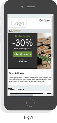 Image – Email view without Responsive Design (Fig. 1) and with Responsive Design (Fig.2), on a smartphone.
This is the way things were until 30 September 2016, with Gmail (see Fig.1 – without Responsive Design).
From 30 September 2016 Gmail supports Responsive Email (see Fig.2 – with responsive design).
And besides, just between us…
… until now, Gmail has always been the “shoemaker’s son who goes barefoot” of Google, in relation to Responsive Design!
Let’s take a look… Google strongly penalises websites without Responsive Design.
Yet, until 30 September 2016, guaranteeing that your emails would be shown as intended (when recipients opened them in Gmail) could prove to be a nightmare – at least, for those that didn’t use E-goi (see “what does Gmail Responsive Email for you, E-goi user?”)
The same happens with Outlook! But… people who live in glass houses? 😉 So better late than never!
What does Gmail Responsive Email mean for you, E-goi user?
In other words, do you have to do anything, to be able to cope with Gmail´s change?
You don’t have to do anything, as long as you activate Responsive (or you have created a specific HTML email for Responsive – should you not be comfortable with HTML).
Now what?
Now, let’s celebrate by doing 😉
If you still don’t have an E-goi account, then…
If you already have an E-goi account, then without further delay
Access your E-goi client area, and…
… send these emails and newsletters >>
B2B Content Marketing Copywriting