With email marketing, design is half of the job. Your brain works his way much faster around a visual element than around a textual one. So why not inspire yourself in some template designs for email marketing that has proved to be great examples of communication? We bring you 5 of those template designs for email marketing for you to try!
Contents
Template Designs for Email Marketing #1
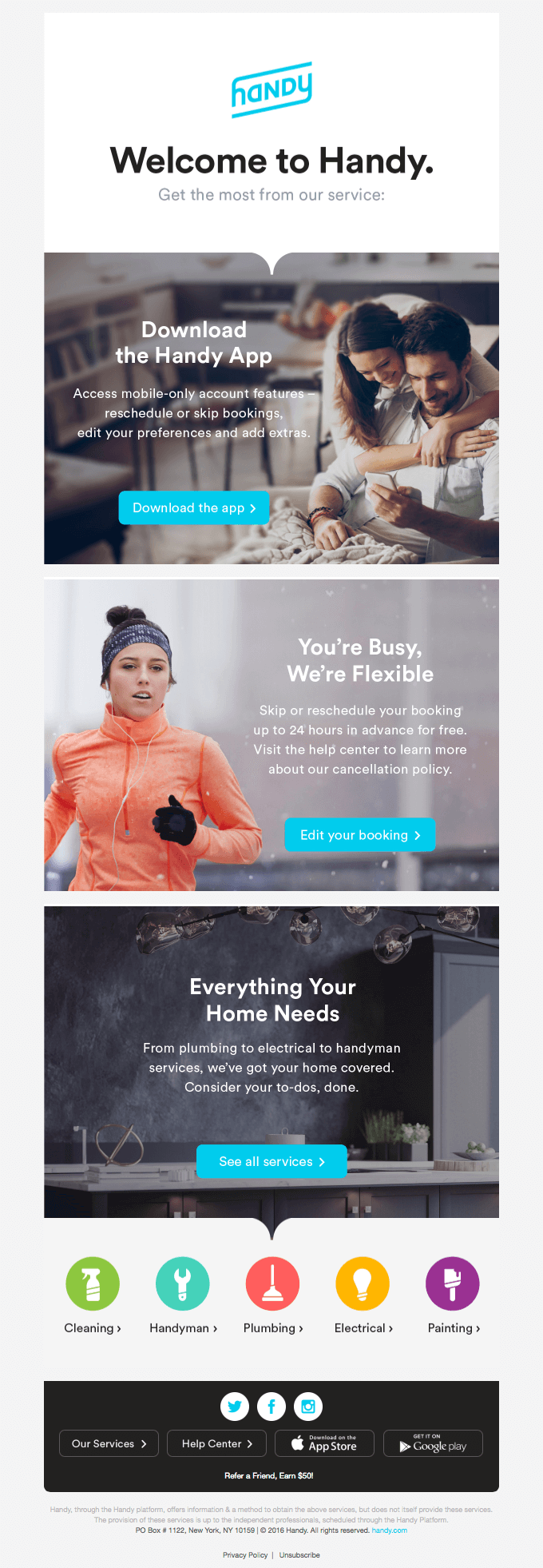
Handy’s template is one of the best we’ve seen in the last few months. A clean visual, no distractions, with an excellent image/text ratio and a choice of images that carry, simultaneously, a dynamic and calm tone to the message.
Template Designs for Email Marketing #2
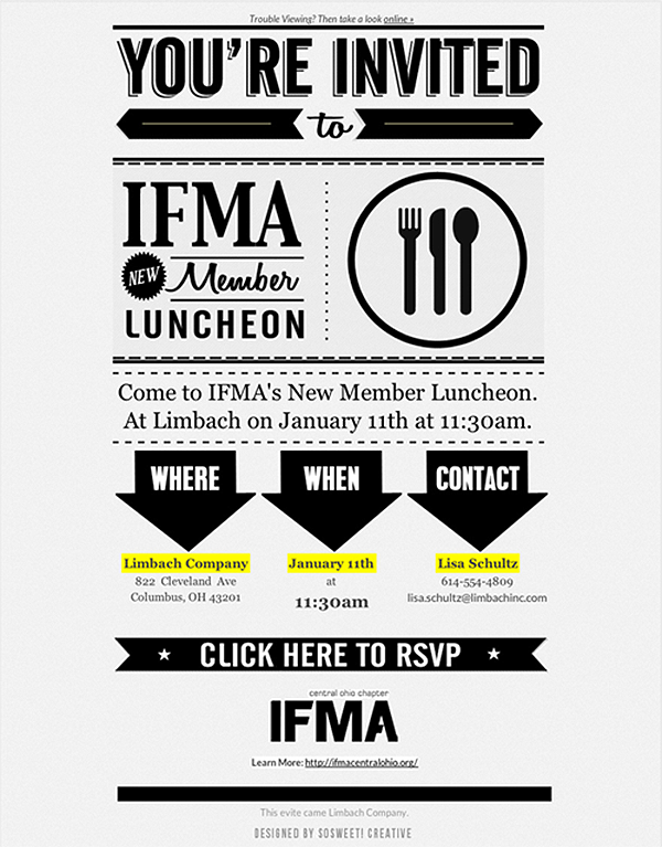
The design teamSoSweet Creative presents us with a typographic party and proves that is possible to work your way around a less clean visual without compromising the email legibility. The final result is a template design for email marketing that drives your attention to the message (in this case, an invitation for an event) while impressing you with its content organization.
Template Designs for Email Marketing #3
Sometimes you go big to drive attention to you, and sometimes you fly below the radar. This brilliant design from the folks at Union Made Goods is as minimalist as possible and let’s the text shine, including the fancy MOM word. It’s a great use of white space and it’s the ideal to communicate calm, warm messages, filled with love and caring.
Template Designs for Email Marketing #4
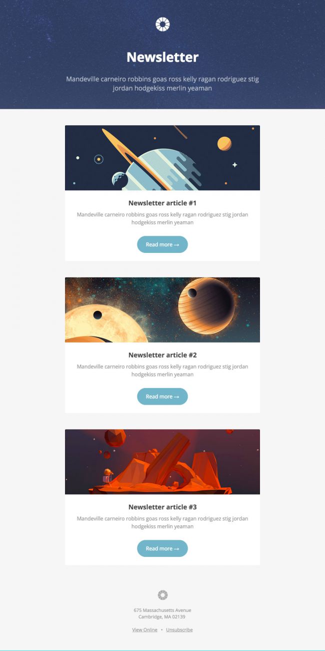
First of all, Pook is free (so feel free to give it a try and see how well it fares with your content). Organized in such a way that highlights the content – blog/website articles – Pook does a wonderful job of minimalist interplay between text and images. The perfect solution to see your CTR skyrocket.
Template Designs for Email Marketing #5
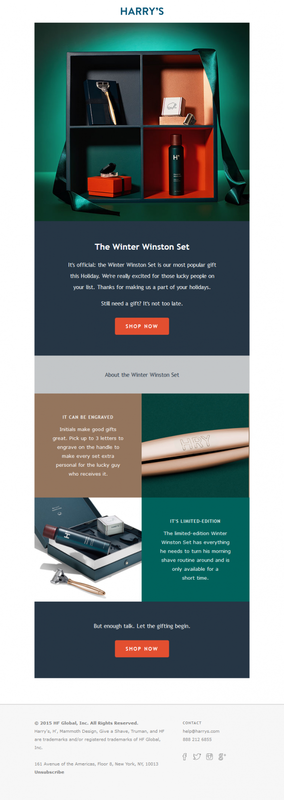
Harry’s case is another brilliant one of template designs for email marketing. Why so? The brand makes use of the color pallette of the advertised product. The newsletter is delivered in little boxes, just like the product, with a great communication between blue and red. It’s a brilliant example of interconnection between product design and email design.


